
Four Color Contrasts
Harmonious Color Combinations

Vital Color Pattern Feel Real
Unlocking Color's Transformative Power: Your Guide to Unique Color Design
Imagine standing at the intersection of science and artistry, where the perfect blend of colors can evoke emotion, create movement, and transform ordinary designs into visual masterpieces that speak directly to the soul. This is where we're headed together!
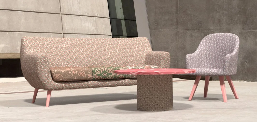
The foundation of our color journey begins with "Feel Real" – Color Marketing Group's 2025 April Color Alert® that beautifully bridges our technological and human worlds. Feel Real is a low-chroma, yellow-influenced red that perfectly embodies the balance between technology and humanity. Selected during CMG's 2023 Latin America forecasting workshops, this earthy hue represents authenticity and connection—values we're all seeking in our increasingly digital world.
What makes "Feel Real" extraordinary is its versatility.
This earthy hue grounds your designs while radiating enough warmth to create instant connection. It's the perfect launching point for building color combinations that resonate with deeper meaning.

Color Marketing Group’s April 2025 Color Alert® Feel Real
Four Pathways to Color Harmony
Johannes Itten’s color principles aren't just academic theory – they're your practical tools for creating designs that captivate and communicate. Let's explore how "Feel Real" transforms through four distinct approaches:

Vital Color Pattern Samples Feel Real
The Dynamic Dance: Warm-Cold Contrast
When "Feel Real" meets cooler tones, something magical happens – your designs gain dimension as warm elements advance while cool elements recede. This visual movement creates energy that draws viewers into your work.

Vital Color™ Feel Real Pattern Samples
The Energized Connection: Complementary Contrast
Pairing "Feel Real" with a near complement (a deep yellow-green) creates visual energy! This combination delivers maximum impact while surrounding analogous hues provide harmony that balances the excitement.
The Depth Creator: Light-Dark Contrast
Light values against dark backgrounds leap forward; dark against light anchors and grounds. By mastering this contrast with "Feel Real" as your foundation, we create remarkable depth even in flat pattern designs.

Vital Color™ Feel Real Pattern Samples
The Sophisticated Balance: Contrast of Saturation
The interplay between intense and muted versions of "Feel Real" and its companions creates subtle sophistication – perfect for designs requiring refinement and nuance.
What's truly powerful about these approaches is their scientific foundation. Research confirms that these color relationships affect viewers consistently regardless of background – meaning we can confidently create designs with predictable visual impact.
The Science Behind the Art
What fascinates me about Itten's color contrasts is that they aren't just subjective artistic principles—they're based on how our eyes and brains process color. Research published in Color Research & Application (Csillag, 2022) confirmed that people consistently perceive these color relationships the same way, regardless of age, gender, or professional background.
For instance, when testing the warm-cold color contrasts, researchers found that 78% of participants agreed that warmer colors appear to advance while cooler colors recede. This scientific validation helps me create patterns with predictable visual effects.

Vital Color Pattern Feel Real

Vital Color Pattern Feel Real
Elevate Your Design
Color theory isn't just academic knowledge—it's a practical tool that elevates design. By understanding these fundamental relationships and starting with a thoughtfully selected foundation color like Feel Real, I create palettes that communicate specific moods and enhance the visual impact of my patterns while staying true to the current color directions.
Whether designing textiles, wall coverings, or digital patterns, I often apply current on-trend colors as a starting point and make them unique to the project’s framework. You might be surprised by all the unique harmonious combinations that can be discovered!
“As a 20-year member of Color Marketing Group, I've witnessed countless color forecasts become reality. The true magic, however, happens in that transformative space where forecast meets brand vision – where we honor both the trend and our unique design perspective.” — Sandra Sampson, CMG
Vital Color Pattern Feel Real
Professional Color Design Services for Your Project
Transform your vision with expert color design. Vital Color™ brings strategic color science, psychology, and aesthetic expertise to make your project stand out.
Contact us today for a consultation and discover how the right color palette can elevate your brand.