
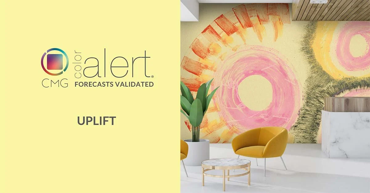
Uplift Creates Perfect Warm-Cool Balance

Color harmony has always been one of design's greatest challenges—until now. Meet "Uplift," a sophisticated yellow forecasted by Color Marketing Group® in 2023 that is now making its mark across markets worldwide. This isn't just another trend; it's a powerful tool that redefines how we think about warmth, energy, and human connection through color.
The Anatomy of Innovation
Uplift isn't your grandmother's sunshine yellow. With its distinctive 5% lightness creating an almost whispered intensity, 30% saturation that speaks in measured tones rather than shouts, and that remarkable 80/20 split between yellow and green influences, this color represents the evolution of yellow from bold statement to nuanced sophistication.
This is yellow reimagined for our time—complex, thoughtful, and profoundly versatile. Where traditional yellows often overwhelmed spaces or demanded to be the star, Uplift collaborates. It elevates without dominating, energizes without exhausting, and warms without overwhelming.

The Psychology of Possibility
Color shapes experience, and Uplift is reshaping how we think about optimism in design. This isn't the aggressive positivity of neon yellow or the nostalgic warmth of butter yellow. Uplift embodies what psychologists call "grounded optimism"—hope tempered with wisdom, energy balanced with tranquility.
The subtle green undertones create a bridge between the stimulating warmth of yellow and the restorative calm of nature. This unique balance makes Uplift particularly powerful for spaces where people need to feel both energized and centered—from corporate lobbies that welcome without overwhelming to bedroom retreats that inspire without overstimulating.

Mastering Warm and Cool Harmonies
The genius of Uplift lies in its chameleon-like ability to play both warm and cool, opening unprecedented opportunities for color harmony. Here's where the magic happens:
With Cool Companions: Pair Uplift with deep teals, sophisticated grays, or crisp whites, and watch it become the warm embrace that prevents cool palettes from feeling sterile. The green undertones create a natural bridge, making these combinations feel effortless rather than forced.
With Warm Allies: Combine Uplift with rich terracottas, warm woods, or soft corals, and it becomes the sophisticated anchor that prevents warm palettes from becoming overwhelming. Its restrained intensity allows other warm colors to shine while maintaining overall balance.
The Monochromatic Marvel: Build entire palettes around Uplift's unique position—lighter versions for expansive surfaces, deeper tones for accent elements, and the pure Uplift as your confident middle ground.

Industry Applications: Where Uplift Shines
Interior Design: Uplift transforms living spaces by creating warmth without weight. Picture a minimalist living room where Uplift-painted accent walls provide soul without sacrificing sophistication.
Fashion: Uplift represents the sweet spot between statement and versatility. It's bold enough to make an impact in accessories, sophisticated enough for professional wear, and complex enough to work across seasons.
This color challenges us to think beyond traditional warm-cool divisions, to embrace complexity over simplicity, and to recognize that the most powerful design choices often come from subtle sophistication rather than bold statements.
Your Creative Challenge
The question isn't whether Uplift will influence your next project—it's how you'll harness its unique properties to create something extraordinary. Will you use it as the grounding force in a cool palette? The sophisticated anchor in a warm scheme? The bridge that connects seemingly disparate elements?
The beauty of Uplift lies not just in its inherent qualities, but in how it amplifies the vision and creativity of the designers who embrace it. This is a color that doesn't just fill space—it creates possibility.
In an era where authenticity, sustainability, and human connection drive design decisions, Uplift delivers exactly what today's projects demand: a color that creates environments feeling both contemporary and enduring, energizing and calming, distinctive and universal.

This sophisticated yellow proves that the most impactful design choices often emerge from nuanced thinking rather than bold gestures. Uplift doesn't just expand our palette—it expands our possibilities, offering designers a tool that works as hard as they do to create spaces and products that truly resonate.
Your next project awaits a color that works with you, not against you. The opportunity is here, and it's beautifully balanced. Contact us for color design expertise.