Color Application
creating unique color palettes

Engaging Your Audience Through Strategic Color Application
Color application is a crucial aspect of design that goes beyond mere aesthetics. At Vital Color, we understand that effective color application involves strategic use of color to enhance functionality, convey messages, and create desired emotional responses, engagement, and brand communication.
-
Driven by Insight
Consumer preferences
Contextual considerations
Current color directions
Emerging trends
Future forecasts
-
Creation of unique, audience-specific color palettes
Thoughtful consideration of color interactions
Strategic color messaging aligned with your brand
-
We recommend integrating color design early in your project timeline. This proactive approach allows for:
Seamless integration across all touchpoints
Maximum impact on your target audience
Cohesive brand storytelling through color
-
Color rendering is a vital process in design that offers several benefits:
Speeds Time to Market
Allows for quick visualization of design concepts
Facilitates faster decision-making and approval processes
Enables rapid iterations and refinements
Reduces Costs
Minimizes the need for physical prototypes
Decreases the likelihood of costly design revisions late in the process
Optimizes material selection before production begins
Increases Value
Enhances the perceived quality of the product or space
Improves user experience through thoughtful color choices
Strengthens brand identity and recognitionescription
-
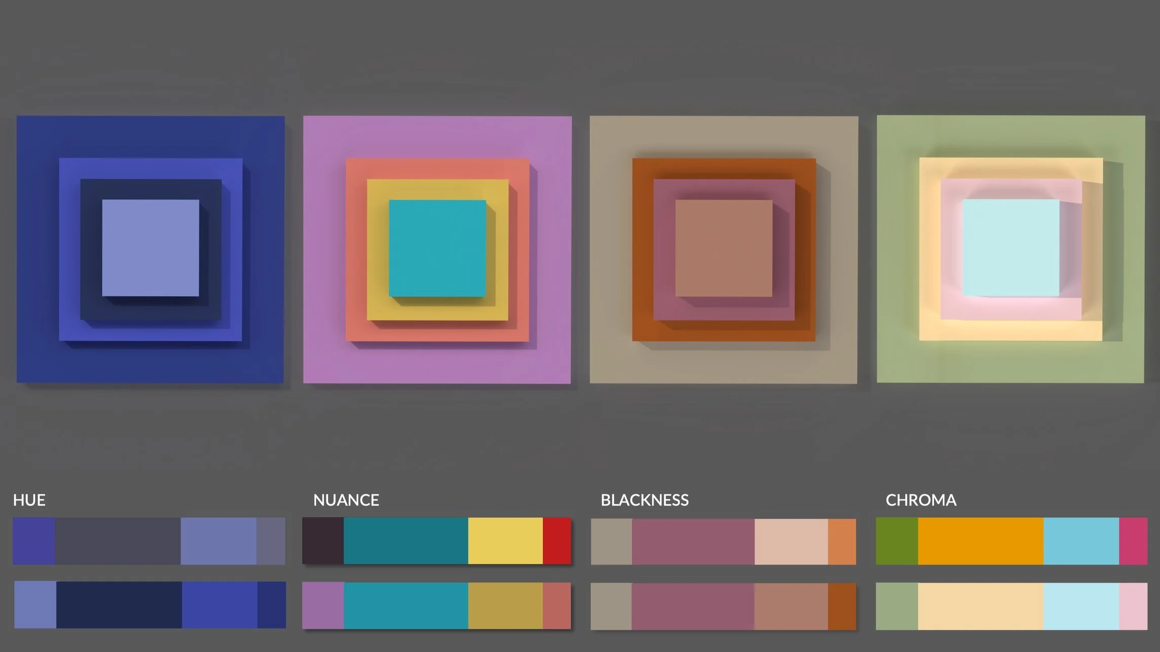
The interaction of colors plays a significant role in effective color application:
Color Harmony
Creates visual balance and cohesion in designs
Enhances the overall aesthetic appeal of a space or product
Color Contrast
Improves readability and visibility of important elements
Directs attention to key areas or features
Color Psychology
Evokes specific emotions and moods
Influences user behavior and decision-making
Spatial Perception
Affects the perceived size and dimensions of spaces
Can make areas feel more open, cozy, or dynamic
Brand Consistency
Ensures uniform color representation across various mediums
Strengthens brand recognition and recall