
Defining Color, The Work Behind the Words
Highlights from ISCC Color Impact Symposium 2026
By Sandra Sampson — Color and Design, Vital Color™ by Simple Modern Style
There are days that remind you why you chose your field, and last week was one of them. I had the privilege of presenting at the Inter-Society Color Council's Color Impact Summer Symposium 2026 — a virtual afternoon that gathered ISCC members and non-members from across science, industry, design, and education around one shared, deceptively simple question: how do we talk about color?
It's a question I live with every day, so being asked to speak to it among this particular group of people was both an honor and a homecoming. What follows is my recap — my own talk, the highlights from every speaker, and the threads that tied an entire afternoon together.
The gap between what we say and what we see
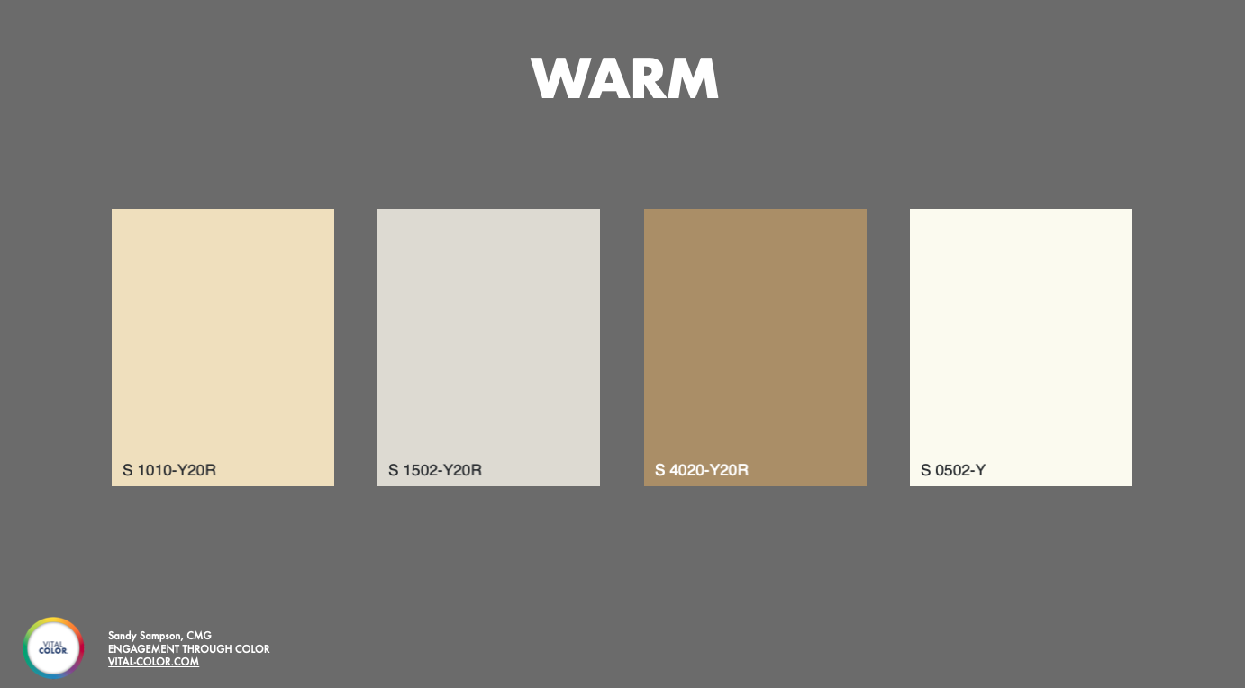
“Warm” is not a color.
My session was called Lost in Translation, The Gap Between What We Say and What We See and it's named for the problem that sits at the center of my design. Clients come to me with words — warm, sophisticated, natural, timeless — and those words mean something real. They describe a feeling, an aspiration, a market position. But warm is not a color. Neither is romantic or natural. They're directions, not destinations. If I hand back a color based only on those words, I'm guessing — and so is the client.
So my work is a series of translations: client language into color language, color language into color notation, and color notation into reality.
Before I ever propose a color, I build what I call color intelligence — a contextual framework drawn from the competitive landscape, color forecasts, cultural currents, and the client's own history of colors used and abandoned. I map those colors into a shared system so the gaps and opportunities become obvious. Then I anchor every selection in CIELAB, Munsell, or NCS notation, because the name might change, the material might change, the light source might change — but the notation stays constant. That's the anchor that lets a color survive the trip from a paint chip to a fabric sample to a digital rendering to a production run, and from my studio to a supplier on the other side of the world.
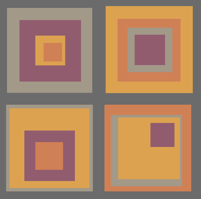
"A swatch on a white card is not the color. It is a starting point. The moment that color is placed next to other colors — a complementary tone, a neutral, a texture, a competitor on a retail shelf — it changes. Its perceived warmth shifts. Its apparent darkness shifts. Even its hue can shift, depending on what surrounds it."
Two ideas I returned to:
You cannot judge a color alone. A swatch on a white card is not the color; it's a starting point. The moment a color is placed next to a neighbor, a texture, or a competitor on a shelf, its warmth, value, and even its hue shift. That isn't a perception quirk — it's physics and neuroscience working together. So I never present colors in isolation. I build renderings and material compositions so that by the time a client approves a direction, they've seen the color behave, not just exist.
Do you want to buy this color, or do you want to see this color?
The color you select — the swatch, the notation — is the inherent color. The color you actually perceive is something else entirely, shaped by the light source, the distance, the surroundings, and the time of day. I build that distinction into my process by recommending clients evaluate colors under the actual lighting they'll live in. What I'm really giving a client at the end isn't just a color. It's a color language they didn't have when we started — a name, a notation, a story, a context. The confidence to walk into a meeting and say exactly what they need. Because color is too powerful to lose in translation.
The Keynote: Chasing Rainbows
Lexicographer and author Kory Stamperopened the day with "Chasing Rainbows: The ISCC, Problem 2, and the Attempt to Define Colors" — a history of what she affectionately called the most important color standard you have absolutely never heard of: the ISCC-NBS Method of Designating Colors. It is also, as she explained, one of the core reasons the ISCC formed in the first place.
The story begins in the middle of a color problem. The U.S. Pharmacopeia — the master listing of drugs in the American pharmacy system — relied on hopelessly vague color language to describe medications. Solutions were "heated to redness"; aloe drifted from "yellowish brown" to "blackish brown" from one revision to the next. When the wrong color could mean grabbing a poison instead of a remedy, that ambiguity was genuinely dangerous. That was "Problem 2."
In 1931, at a major color exhibition at New York's Museum of Science and Industry, color people from industry, the arts, science, fashion, and education realized they all faced versions of the same struggle — and delegates from twenty groups founded the Inter-Society Color Council in pursuit of "greater uniformity in the designation and standardization of color."
The hero of Kory's account was I.H. Godlove, the chemist and self-described Renaissance man of color who led Problem 2. His central insight still resonates: no single method of describing color is inherently better than another — it depends on context, and you cannot describe a color until you have measured and specified it. The bridge he reached for between technical measurement and plain English was the Munsell system, with its hue, value, and chroma, and its founding principle that the eye should set the standard for how we measure color.
The twist is that Godlove was leading a double life. At the same time, he had been recruited to write the color-name definitions for Webster's New International Dictionary — a task a senior scientist had dismissed because color names are "merely arbitrary labels... often fantastic and bizarre," and therefore beneath his notice. But that dictionary work taught Godlove the lesson that anchored the whole endeavor: ordinary people meet color through those fanciful names, not through numbers. As he came to see it, nobody walks into Sherwin-Williams asking for "a blue of medium saturation and high brilliance" — they ask for a light blue. Plain color names had to be part of the answer.
What followed was years of painstaking measurement by Dorothy Nickerson, a color specialist at the USDA, alongside Deane Judd and Kenneth Kelly at the National Bureau of Standards, who by 1939 had mapped Godlove's rubric onto hundreds of color names and, by 1940, christened it the ISCC-NBS system. Godlove died suddenly in 1954, a year before the first standard was published — and in a poignant turn, his widow Margaret Godlove, herself a gifted spectrophotometrist who had been barred from working after marriage, helped produce the centroid color charts that finally completed the system her husband began. A fitting bit of symmetry, as Kory put it.
And yet every standard, she reminded us, eventually begins its journey toward becoming a relic. Color names waffle — Godlove once groused about finding seventeen "aquas" in a single batch, not one of them colorimetrically aqua. New colors such as fluorescents and phosphorescents fall outside the original gamut. And trends move on: "shrimp pink" once signaled luxury and now mostly evokes salmonella. The quest for a shared way to talk about color never truly ends — which made her closing the perfect setup for the rest of the day. Hope springs eternal, she said, if only for shrimp pink's sake.
Session one: how industry defines color
Sue Kim, Director of Color Marketing at Sherwin-Williams, spoke on The Language of Marketing. Her central point: the color name is the anchor for everything — in-store experience, digital tools, PR. A name has to carry an emotional, experiential story while still reflecting the true form of the color. Her best illustration was a single red that becomes "Showstopper," "Classic Red," "Ruby Slipper," or "Safety Red" depending on brand persona and application — and "Poppy" in the UK, where the flower signals remembrance of World War I. Every name also passes through trademark, legal, and inclusion review before it reaches a shelf.
Ann Laidlaw of ACL Color Consulting offered what she cheerfully called a "speed date" with CIELAB. Words get confusing when you need to be exact — she noted that the same color difference might be described as "thinner or fuller" by one team and "brighter or duller" by another — which is precisely why we use numbers. CIELAB, adopted by the CIE in 1976, gave the industry one shared number (ΔE*) in place of the seventeen competing metrics she once juggled at Burlington Industries. It was transformative for communication, she said, even if it was never perceptually uniform — pretending otherwise, in her words, is like pretending West Virginia has no mountains.
Jerald Dimas of Color Communications, LLC followed with Color Matching Tolerances for Visual Quality Tools, making the case for physical color standards. Establishing a target means balancing what a manufacturing process can actually hold, what's visually acceptable, and the economics behind it all. He walked through metamerism control, standardized lighting, and a wonderful range of real-world examples — National Park Service colors designed to minimize contrast with the landscape, aviation fuel-filter contamination standards, Coca-Cola's proprietary red, and the legend of William Wrigley personally auditing packaging at newsstands.
Justin Laird, Principal Color Engineer at Apple, delivered Measuring What Customers See. The Gap Between Color Metrics and Surface Appearance — for me, one of the day's most forward-looking talks. His argument: spot-based color metrics like a single ΔE value capture color, but not appearance. What a customer sees holding a product in their hand also includes gloss, texture, geometry, spatial variation, and the surrounding environment. The legacy tools were right for their time, but materials and lighting (hello, LEDs) have changed, and tolerances now press against the limits of the instruments themselves. His call to action was for integrated systems that feed spectral, spatial, geometric, and environmental data into a model that predicts what the customer will actually see — an evolution of our tools, not a replacement.
Session Two: How Designers and Educators Define Color
After my own talk, Robert Hirschler, of the Colour Literacy Project, shared Problems of Colour Terminology in Portuguese — the work of a four-person team of Brazilian professors mapping how color words are actually used. Echoing Kory, he stressed that dictionaries are descriptive, not prescriptive; the team isn't trying to be the "word police," but to map real usage and recommend a new standard. A telling example: the Portuguese brilho can mean both brightness and gloss, two very different concepts sharing one word — exactly the kind of ambiguity that derails technical communication.
Luanne Stovall of the University of Texas at Austin closed the sessions with Colour Literacy in the 21st Century, contrasting "old school" color (pre-physics, pre-neuroscience, color as something merely "out there") with a modern understanding. Her framing — vision takes up roughly half our brain's resources, and all vision is color vision — set up the mission of the Colour Literacy Project, a joint ISCC and AIC effort to rebuild color education on a 21st-century foundation. I loved hearing about her students' "color swatch safari" and weekly color diaries, where naming colors in the wild dissolves the fear that they don't know anything about color.
A well-earned honor
Fittingly, Luanne Stovall was also presented with the Nickerson Service Award, recognizing outstanding long-term contributions to the Council — from her work on the board since 2019 to leading Fluorescent Fridays and hosting the Colour Literacy Forums. Named for Dorothy Nickerson, a pioneering color scientist, it could not have gone to a more deserving member.
The panel: the challenge of specifying color
ISCC President Jennifer Kruschwitz moderated a closing panel on the challenges of specifying color, and the conversation ranged from the gamut-bending arrival of ultra-blacks and hyper-reflective whites, to the real-world impact of LED lighting, to whether anyone still uses Pantone. (My answer: not so much anymore — the color science has freed me to work in material-independent systems like NCS and Munsell, then convert back when I need to.)
The richest exchange was about whether a universal color language is even possible. Kory's view, as a language expert, was that distilling all of color into one dialect would strip away the texture that makes it rich — but a small shared vocabulary that people can layer their own languages on top of is achievable, which is exactly what the Colour Literacy Project pursues. She also shared how the work changed her: she came to color through a single dictionary definition, and now can't look at her built environment — down to the black of her keyboard — without seeing the enormous chain of people who picked, tested, and matched every color in it. Robert reminded us how hard the modifiers — vivid, brilliant, deep, blackish — are to translate across languages.
Leaving grateful
I left the symposium grateful — for an organization that is, at its heart, its people, and for an afternoon that approached the same problem from eight different angles and arrived, again and again, at the same truth. There may be no single universal language for color. But the shared vocabulary we build together — notation, science, and nuance — is what lets us be precise, intentional, and understood.
That's the gap I work in every day. Color is too powerful to lose in translation.
A big thank you to Maggie Maggio from Smashing Color for putting together this Symposium!
Sandra Sampson is a color and design consultant and the founder of Vital Color™ by Simple Modern Style, and a board member of the Inter-Society Color Council. Learn more at Vital-Color.com.